Our workPresence Sharing
Pocket Status
A red, amber, green light for the people who matter — quiet clarity instead of the are-you-busy cycle.
The brief
What it had to do.
The messages that cost the most are the ones that only exist to ask whether it is a good time. Are you busy. You free. Quick one. Each is an interruption whose entire purpose is to avoid interrupting, and the reply arrives after the moment it was about.
Pocket Status replaces the question with a glance. A traffic light, a short note, and a link you choose who to share with. The product's own line is the design brief: no calls, no texts, no interruptions — just quiet clarity.
What we built
The parts that make it true.
A status anyone can read in a second
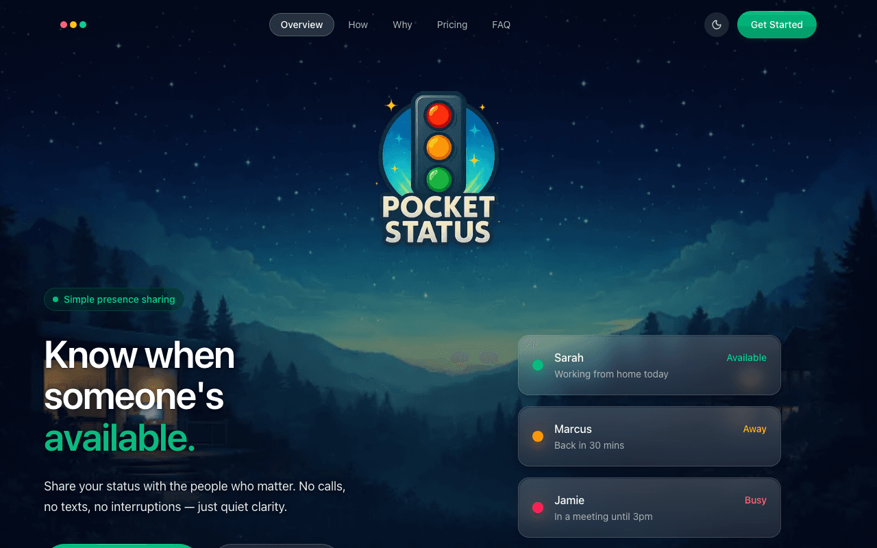
Green, amber, red, one tap to change, with a 140-character note for the context a colour cannot carry — back in 30 mins, in a meeting until 3pm, working from home today.
A share link, not a follower graph
One personal page you send to the people you want aligned with. No accounts to accept, no network to build, and nothing about who sees you that you did not decide.
Auto-reset and scheduled statuses
A 30-minute, one-hour or custom timer so a status cannot quietly lie all afternoon, plus recurring rules on the paid tier — weekdays 9 to 12 is focus time — so the common cases set themselves.
Widgets on every surface
iOS, Android and desktop widgets, because a presence app that needs opening has already lost to the message it was meant to replace.
What’s live
Shipped, and in use.
- Traffic-light status with one-tap change
- 140-character status note
- Public share link at your own address
- Auto-reset timers: 30 minutes, an hour or custom
- Scheduled and custom statuses with colours, emojis and labels on Pro
- Widgets for iOS, Android and desktop
- Free tier with a monthly and annual Pro plan
The detail
The decisions behind it.
The demo is the hero
Three named people with three states and three short notes, sitting in the hero where a screenshot usually goes. A product this simple is explained faster by showing one minute of it working than by any paragraph describing it, and the nav labels — Overview, How, Why — follow the same instinct.
Privacy as a feature, in plain words
Privacy-first, instant sync, works everywhere, free forever, stated in four chips under the fold's first button. For a product whose subject is knowing where people are, the question of who can see you has to be answered on the way in, not in a policy nobody opens.
Want one of your own?
Every way we build is priced on one page, with a date attached to each. No call required to see a number.
More work